Image courtesy of TCGdex.net
Two Prints, One Iconic Card: A Deep Dive into Japanese vs English Card Layouts
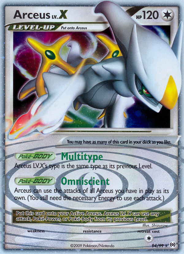
For Pokémon TCG collectors and players, card layout is more than a pretty frame—it’s a language. Different print runs can tell you where the card was printed, when, and sometimes even how the game was meant to be played at that moment. The Arceus LV.X card from the PL4 set—rare holo LV.X, illustrated by Shizurow, and functioning as a Level-Up stage Colorless Pokémon—offers a compelling case study. In English, this card’s presentation follows a familiar Platinum-era cadence: a holo flourish, clear “LEVEL-UP” labeling, and a Poke-BODY Multitype ability that teases Arceus’s shifting identity. In Japanese, print conventions often adjust text length, label placement, and typography to fit the language’s rhythm. Together, these prints reveal how design choices influence readability, strategy emphasis, and long-term collectability ⚡🔥.
Snapshot: what the card tells us in English (PL4)
- Set: Arceus (PL4) — Platinum-era print with a Rare Holo LV.X rarity designation.
- Type: Colorless
- Stage: LEVEL-UP
- Illustrator: Shizurow
- Rarity: Rare Holo LV.X
- Evolution: Level-Up from Arceus, reinforcing the long-running LV.X mechanic of this era
- Ability: Poke-BODY Multitype — Arceus LV.X’s type is the same type as its previous Level
- Retreat: 1
In this English presentation, the typography, spacing, and label conventions are designed to guide the eye through the card’s story: the image takes center stage, the card’s name and LV.X designation sit prominently, and the Multitype ability is presented as a concise, readable block. The holo treatment reinforces rarity and prestige—things collectors adore when flaunting a card in a display case or binder spread.
What usually changes when the same card ships in Japanese print
- Length and line breaks: Japanese typography tends to squeeze more information into compact lines, which can lead to different wrap points and slightly altered perceived emphasis. This often means the Multitype ability and any flavor text appear with different line breaks, altering how quickly a reader grasps the ability’s implications.
- Labeling and terminology: English cards typically use terms like “Poke-BODY” and “LEVEL-UP,” while Japanese prints adapt these concepts into localized wording. The core concept—Arceus changing type with its previous Level—remains, but the surrounding phrasing shifts to fit kana/kanji rhythm and space constraints.
- Layout balance: Set symbols, rarity stamps, and the placement of the illustration box can differ. Japanese cards from the same era often prioritize denser text blocks and slightly different margins, producing a distinct visual identity even for the same art and illustration.
- Foil and border treatment: The holo treatment persists, but subtle differences in foil density and border color can give Japanese print orders a different “spark” in person. Collectors sometimes prefer one aesthetic over the other, leading to separate valuations in certain markets.
- Flavor and clarity: The Japanese edition might include small stylistic adjustments—such as punctuation, emphasis marks, or alignment cues—that affect how fans interpret the card’s narrative and mechanical cues at a glance.
Across both prints, the Arc of Arceus is preserved: a versatile Colorless “shape-shifter” whose identity is tethered to its prior Level. The English version foregrounds this with a clean, legible layout that’s been time-tested for tournament play and collection alike. A Japanese print, meanwhile, invites fans to notice the subtler typography shifts and the way the art and text cohabit the same canvas—an experience that can feel almost like comparing two different translations of the same epic moment 🎴🎨.
Gameplay implications of layout decisions
Even when the mechanical rules don’t change across print runs, layout affects how players internalize them. The Level-Up mechanic for Arceus LV.X relies on a precise recognition of “LEVEL-UP” as a state, and Multitype as an adaptable tool in a Colorless frame. In English prints, the ability text often sits in a single, readable block—easy to scan during a match, which helps players quickly decide how to leverage Arceus’s shifting type when facing a succession of weaknesses and resistances in the meta. The Japanese variant’s denser text and subtly different line breaks can alter those quick read impressions, nudging players to pause a beat longer to confirm the exact wording and its implications.
From a collector’s lens, this matters too. A card’s layout influences how it sits in a binder spread; it affects per-page density, the ease of finding a specific ability phrase, and even the way the holo glare plays with the foil. Shizurow’s evocative illustration gains an aura of prestige in holo form, and that aura often translates into secondary market interest, especially for LV.X-era cards that marked a high-water mark for Level-Up design concepts.
Collector insights and the allure of LV.Xs
Rare Holo LV.X cards sit at an appealing intersection of playability and display value. The Arceus LV.X from PL4 is particularly loved for its iconic role in the era’s evolving rules and its versatile Type-Shift mechanic. The LV.X line—level-up evolutions with special HP and attack profiles—captured the imagination of players who enjoyed layered strategies and “what-if” matchups. The English print’s legible typography and clear articulation of Multitype make it a staple for modern display cases and price guides alike, while the Japanese print’s typography and balance offer a parallel, aesthetically distinct experience that many collectors chase for completeness and visual variety.
For fans of Shizurow’s artistry, owning a holo LV.X card with this illustration means not only a tactical piece but also a time capsule from a period when the Pokémon TCG experimented with bold, collectible designs that blended artwork with game mechanics in a memorable way ⚡💎.
Where the value and story meet
Price and demand for LV.X cards are influenced by their rarity, foil treatment, and the nostalgia surrounding the LV-X mechanic. The Arceus LV.X card carries a legacy that resonates with both old-school collectors and newer players who savor the era’s art direction and the strategic possibilities those level-up evolutions promised. As with many Japanese vs English print debates, the true value often lies in the story you tell with the card—how the art, the words, and the gameplay synergy speak to you as a fan.
Ready to bring a practical, stylish accessory into your daily routine? Check out the Product below and keep exploring the network links to see how hobbyist and broader tech audiences alike engage with collectible strategy and storytelling through cards and beyond.
Phone Click-On Grip Reusable Adhesive Phone Holder KickstandMore from our network
- https://crypto-acolytes.xyz/blog/post/demystifying-defi-perpetual-swaps-a-practical-guide/
- https://blog.digital-vault.xyz/blog/post/legends-behind-the-untap-upkeep-draw-phase/
- https://crypto-acolytes.xyz/blog/post/shiny-charm-hunting-in-pokemon-black-2-and-white-2/
- https://crypto-acolytes.xyz/blog/post/fartcoin-sparks-solana-meme-coin-trend-amid-on-chain-momentum/
- https://blog.digital-vault.xyz/blog/post/automate-lead-capture-and-follow-ups-to-increase-conversions/