Image courtesy of Scryfall.com
Art on the Edge: Coastal Drake’s Serious Aesthetics Versus Parody Playfulness
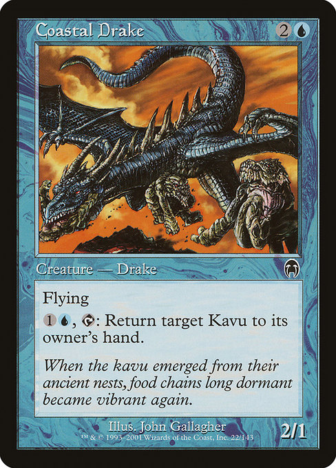
Magic: The Gathering has long teased the line between earnest fantasy and playful caricature. Coastal Drake, a blue Drake from the Apocalypse set, sits squarely in the realm of serious aesthetics—but its very existence invites comparison to the mock-sincere worlds you see in parody sets and sets that wink at the players. The artwork, color palette, and creature flavor all work together to embody the elegance of tempo—a classic blue tactic that asks you to read the wind, not just the board. 🧙♂️🔥
From a pure gameplay perspective, Coastal Drake is a compact tempo piece: a 2/1 flier for {2}{U}, which is respectable enough to threaten early air power while leaving mana for other shenanigans. The real trick is its activated ability: “{1}{U}, {T}: Return target Kavu to its owner's hand.” Yes, a creature returns a creature—specifically a Kavu, a nod to the Mirage block’s menagerie. This is where color identity and design meet strategy: blue’s toolkit is not just about drawing cards and counterspells; it’s about bending the opponent’s plan with precise tempo plays. The art and text work in tandem to convey that you’re not just dropping a dragon; you’re corralling a stubborn, outsized lizard and forcing a repositioning of threats. ⚔️
Coastal Drake’s lore-friendly frame and the flavor text—“When the kavu emerged from their ancient nests, food chains long dormant became vibrant again.”—anchor it in a world where coastlines teem with hidden power and ancient ecology collides with spellcraft. The card’s blue identity shines in the cool hues and wave-swept background that suggest motion and air, not earthbound brute force. In that sense, the artwork leans toward seriousness: the drake’s gaze is focused, the lighting is restrained, and the composition emphasizes a natural discipline that a tempo deck loves to embody. 🎨
Flavor and art meet at the shoreline: Coastal Drake embodies the quiet precision of blue, where every swing of mana is a measured breath rather than a shout. It’s a reminder that not every epic moment needs a dragon-breath eruption—sometimes the art of a plan is in the glide, not the roar.
Now, contrast that with parody cards—think Un-sets that lean into humor and caricature, where the art might revel in in-jokes or over-the-top puns. In parody designs, artists often embrace exaggeration, mismatched proportions, or winking symbols that invite a chuckle before the game ever begins. Coastal Drake stands as a counterexample to that impulse: its beauty is rooted in realism and fantasy-tinged serenity, which makes the card feel like a credible participant in a serious urgent moment. The contrast matters. It helps players recognize how tone—whether earnest or spoofing—shapes our expectations of a card’s role on the battlefield and in the broader lore. 🧙♂️💎
That tension also echoes in the way players discuss art direction. Parody cards often celebrate a playful, almost cinematic mischief—the sort of style that thrives on bold shapes and bawdy humor. Coastal Drake, by contrast, uses composition, lighting, and a restrained color range to evoke wind and water—an aesthetic that signals “this is a card you plan with, not a joke you tell.” The result is a painting that feels anchored in a real world of coastlines and skies, even as it exists within a fantasy frame. It’s a reminder that good card art doesn’t just decorate a card; it communicates tempo, mood, and strategy. 🧭
For collectors and players alike, Coastal Drake also offers a fascinating study in design economy. A common foil in this era, it remains a today’s reminder of how early 2000s Wizards of the Coast art direction balanced naturalism with fantastical flourish. The set is Apocalypse (APC), a time when the frame and border choices leaned into a bold, dark-outline look that keeps blue’s coolness intact on the battlefield. The card’s rarity is common, which means you’re likely to see it in draft and casual play more often than as a flashy foil—although this particular piece does have a foil finish option in some printings, a small but real nod to its collectible appeal. Its illustrator, John Gallagher, brings a crisp line-work quality that helps the drake feel both airborne and personally aware of the coastline it glides above. 🔷
As you plan out your weekend games or your next vintage-sealed session, think about how art influences your expectations of a card’s value—not only in money but in the kind of story you tell with your plays. Coastal Drake’s art and mechanics invite you to think in terms of tempo, control, and spatial awareness, the kind of game state where a single blue creature can swing momentum with a well-timed bounce. If you’re a fan of the interplay between lore and art, you’ll notice how the piece refuses to surrender to the obvious “big dragon” trope and instead gives you a quiet, confident gliding figure that exudes cool expertise. 🧙♂️⚡
And if you love assembling a well-rounded, travel-ready collection that can keep pace with the multiverse’s many flavors, consider keeping your gear as polished as your play. For a practical, real-world crossover, our featured product range offers rugged protection for life on the go—because the last thing you want on the road is a cracked phone case while you’re navigating a seaside siege in your favorite blue deck. 🔥
Rugged Phone Case: Impact Resistant Glossy Finish
More from our network
- https://blog.rusty-articles.xyz/blog/post/how-grading-affects-skiploom-value-and-resale-in-pokemon-tcg/
- https://blog.rusty-articles.xyz/blog/post/dr3-sharpens-hipparcos-distances-to-a-hot-blue-star-in-scorpius/
- https://transparent-paper.shop/blog/post/mastering-product-hunt-how-to-use-it-effectively/
- https://blog.rusty-articles.xyz/blog/post/building-a-blue-aethersnipe-combo-deck-etb-bounce-loops/
- https://crypto-acolytes.xyz/blog/post/will-meme-coins-survive-regulatory-crackdowns/