Image courtesy of Scryfall.com
Art Style Through the Ages: A Look at MTG's Visual Evolution
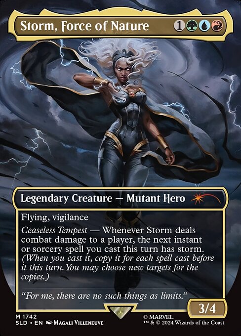
Magic: The Gathering has always been a visual diary of fantasy, rumor, and bravura brushwork. Each decade brought its own sensibilities, from the hand-painted epics of the early era to the polished digital tableaux of today. The recent release featuring Storm, Force of Nature—a tri-color powerhouse with a mythic aura—serves as a perfect case study in how MTG art has evolved while staying rooted in the same sense of wonder 🧙♂️🔥. This card, printed in a modern Secret Lair Drop with a borderless, inverted frame and full-art presentation, showcases how artists blend bold color and kinetic motion to convey a story at a glance. The art isn’t just decoration; it’s a narrative engine that invites you to feel the wind before you read the rules text ⚔️🎨.
In the 1990s, MTG art tended toward dramatic line work and adventurous fantasy motifs. The planeswalkers and creatures of that era carried a tactile, painterly feel—almost like the pages of a mythic illustrated book. Fast-forward to the 2000s, and digital color and compositional experiments broadened the palette. You began to see more complex skies, more dynamic action scenes, and a sense that a character’s power could be expressed through the atmosphere around them. Storm, Force of Nature sits squarely in that lineage, but with a contemporary twist: a seamless triad of colors—green, blue, and red—that signals not just a mana cost but a philosophy of synthesis and risk. Its mana cost {1}{G}{U}{R} is a compact manifesto of collaborative force, where nature, intellect, and ferocity collide in a single card. The 4-CMC mark hides a lot of kinetic potential, and the artwork captures that energy in a single frame 🧭💥.
The 2010s introduced a wave of borderless, full-art frames that turned the card into a canvas you could frame on a wall. The Storm card’s frame effects—legendary and inverted—are not cosmetic tricks; they reflect a shift in how Wizards of the Coast treats collectors and display. Full-art tends to push the creature or spell into the foreground of the viewer’s memory, while inverted frames often signal a special, premium moment in a card’s life cycle. Magali Villeneuve’s art for Storm, with its luminous skies and sweeping motion, embraces this ethos: the tempest isn’t just something that happens to the character; it is the character’s environment, a living, breathing cyclone that mirrors the spellcraft at play 🌀🎯.
Design-wise, the card’s three colors are more than a mechanic—they’re a design language. The tri-color identity invites multisource interaction—think combo potential, multi-resource ramp, and cross-color threats. The card’s text evokes a dramatic play pattern: “Ceaseless Tempest — Whenever Storm deals combat damage to a player, the next instant or sorcery spell you cast this turn has storm.” This is a meta-narrative as well as a rule interaction. The storm ability, copied by the number of spells cast earlier that turn, becomes a crescendo of strategic tempo. The artwork’s storm motif—bolts, roiling clouds, and a hero who seems to ride the gusts—visually communicates the very idea of momentum and repetition. In short, the art and the text sing together, a synergy that has become a hallmark of modern MTG design 🧙♂️⚡.
Beyond the card itself, this piece sits at an intersection of art distribution and collecting culture. The Secret Lair Drop introduces a curated, premium flavor to MTG’s roster, often featuring borderless frames and high-production value. The inverted frame signals a special-issue feel, which collectors savor, much like a gallery piece in a modern art show. The full-art presentation emphasizes immersion: you’re not just playing the spell; you’re stepping into the storm. In a broader sense, this mirrors a trend in recent decades toward highly thematic, artist-centric releases that celebrate both the world-building and the craft of illustration. For fans who grew up with the crisp edges of early cards, these newer designs feel like stepping into a storm door—one you can walk through with a keyboard, a deck, and a cup of tea 🧭🌀.
As a player, Storm, Force of Nature invites you to think about how art informs play. A strong, atmospheric image can nudge your decisions: when you see a tri-color ensemble fighting through a tempest, you may be more inclined to value tempo and interactive play over pure board presence. It’s a reminder that MTG art is not just background color—it’s a storytelling device that shapes how we perceive tempo, control, and risk. The tri-color composition also echoes the broader trend of color-pixing in strategy design: you’re encouraged to blend resources, coordinate effects, and weave a narrative across turns. The card’s lore line—“For me, there are no such things as limits.”—feels like a thematic tagline for the art that surrounds it, a reminder that the multiverse is a canvas for pushing past boundaries 🧩🎯.
Collectors and players alike appreciate the tactile memory that art creates—the same way a favorite sleeve or a well-worn playmat can cue a precise feeling when a match begins. Speaking of playmats, for enthusiasts who want to keep pace with the storm in real life, a sturdy, non-slip surface is invaluable. That’s where the featured product comes in: a reliable mouse pad that keeps your focus on the game while your fingertips ride the rhythm of the storm on the battlefield. When you pair a striking card like Storm with a dependable desk companion, you’re leaning into a workflow that mixes nostalgia with modern convenience 🧙♂️🎲.
Non-Slip Gaming Mouse Pad 9.5x8.3mm Rubber BackMore from our network
- https://blog.digital-vault.xyz/blog/post/tangelas-evolution-visual-design-shifts-to-tangrowth/
- https://articles.zero-static.xyz/blog/post/how-delays-shape-expectations-for-ghost-recon-breakpoint/
- https://transparent-paper.shop/blog/post/sell-your-first-100-digital-downloads-a-beginners-guide/
- https://blog.zero-static.xyz/bolg/category/gaming/
- https://crypto-acolytes.xyz/blog/post/centaurus-blue-star-35000-k-illuminates-photometric-luminosity/