Image courtesy of Scryfall.com
Typography and Card Frame: a case study from The Brothers’ War
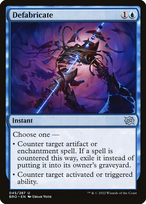
When you study a blue instant like Defabricate through the lens of typography and layout, you start to notice how MTG designers balance readability with the need to convey two distinct, powerful options in a single card. The Brothers’ War frame remains faithful to the modern MTG aesthetic while leaning into a vintage, almost blueprinted feel that echoes its mechanical, artifact-heavy themes 🧙♂️🔥. The mana cost sits neatly at the top-right, with the familiar "{1}{U}" alignment that instantly signals tempo and permission to players who love a good counterspell-style play. The type line—Instant—sits squarely above the body text, and the color identity of blue is reinforced not just by the art and mechanics, but by the typographic weight used for the rule text and the two “Choose one” options that define the card’s personality ⚔️.
Defabricate is an uncommon instant with a clever two-for-one offer: either counter an artifact or enchantment spell (and exile it if countered) or counter a targeted activated or triggered ability. That single line of Oracle text is a study in how MTG typography can carry dual meaning without overwhelming the reader. The line breaks effectively split the two modes, guiding the eye from the header to the function and then to the nuance—exile instead of graveyard in the first option, a targeted ability in the second. This is a subtle typographic choreography that makes the decision feel instantaneous, even when you’re pausing mid-game to weigh the counterspell dance 🧠🎲.
Color differentiation is more than a color blend; it’s a typographic signal. The blue frame and blue mana symbol set the expectation that this spell interacts with artifacts and enchantments—core targets for artifact-focused decks. The rarity designation—uncommon—sits with a small but elegant set symbol. In The Brothers’ War, the set symbol has a compact silhouette that doesn’t fight with the text box, allowing the two-line Oracle text to breathe. The font size and line height chosen for the card’s body text strike a careful balance: readable in a glance, but dense enough to convey all necessary details during a quick fetch or a clutch moment in multiplayer politics 💎.
Design language and the two-mode decision
The two distinct options on Defabricate demonstrate how typography and layout can influence strategic cognition. The first option explicitly targets noncreature, nonland permanents—artifacts and enchantments—while the second zooms in on the immediacy of a game state with activated or triggered abilities. The typography mirrors this distinction with a clean, compact presentation that avoids clutter. You feel the rhythm of the card as you read: “Choose one —” line breaks followed by the two bullet-like choices, each separated by the line break rather than a traditional bullet. It’s a design choice that reinforces the sense of consequence: you’re not selecting a single effect; you’re selecting a path, and the typography mirrors that choice with tempo and clarity 🧙♂️⚔️.
From a layout perspective, the card uses a predictable hierarchy that keeps the eye in a familiar loop: name and mana cost up top, type line below, then the rules text, and finally the artist credit and set information. This predictability is a strength for players across eras, especially when you’re scanning your library for a counterspell window during a heated match. The font decisions—bold for the card name, a standard-weight body text, and a compact rules layout—are designed to minimize hesitation in the heat of play, a design goal that every veteran MTG player quietly appreciates 🧙♂️🎨.
Art, lore, and the craft of material quality
The Brothers’ War era leans into a lore-rich, artifact-centric universe, and Defabricate embodies that tension between control and timing. While the card’s literal effect is a form of countermagic, the surrounding typography and frame choices evoke the sense that you’re bending mechanical forces to your will. The rarity notch, metallic sheen, and the blue color identity all tie into a cohesive feel: the card is not merely text on a frame; it’s a concise manifesto of tempo control, problem-solving, and the elegance of exile as a strategic payoff 🧭.
For collectors and players who pore over set lists, Defabricate also marks how modern frames keep classic ideas accessible. The text remains legible on a crowded desk, and the art text ratio ensures that you don’t miss a line while you’re weighing a late-game play. The art credit to Uriah Voth and the vintage-futuristic aesthetic of The Brothers’ War merge with typography to create a card that looks as good in sleeves as it reads in a tournament guide or a casual blog review. It’s a small reminder that MTG’s layout design is as integral to the game’s experience as the spells themselves 🧙♂️💎.
To bring a little real-world MTG vibe into your workspace while you study typography and card frames, consider a desk companion that reflects the same careful balance of form and function. The product linked below is a microcosm of that idea—a custom mouse pad designed to keep your notes and diagrams clear as you map out if Defabricate fits your opponent’s board state during a blue-heavy game night. When form meets function, you get a desk space that feels as crisp as a well-typed card text and as satisfying as a perfect block of blue mana being untapped 🔷🎯.
Product Spotlight: Custom Mouse Pad 9.3 x 7.8 Non-Slip Desk Mat
Custom Mouse Pad 9.3 x 7.8 Non-Slip Desk Mat
More from our network
- https://transparent-paper.shop/blog/post/sell-notion-templates-online-a-practical-guide/
- https://crypto-acolytes.xyz/blog/post/solana-ecosystem-2025-trends-dapps-and-growth-outlook/
- https://blog.rusty-articles.xyz/blog/post/defiant-ogre-art-parody-vs-serious-mtg-imagery/
- https://crypto-acolytes.xyz/blog/post/dr3-evidence-shows-hot-blue-star-fits-mainsequence/
- https://blog.digital-vault.xyz/blog/post/collectors-vault-expanding-plane-culture-through-artifacts/