Image courtesy of Scryfall.com
Judith, the Scourge Diva and the Art of Perspective in Commander Masters
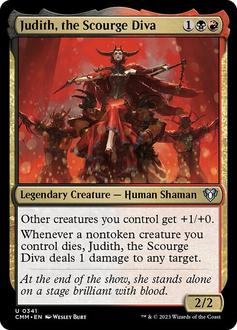
In the shadow-soaked halls of a Blood Hall, Judith strides as if the crowd itself were a living creature—the kind of presence that makes you lean in, even as your opponent’s board conspires to topple your plans. The artwork for Judith, the Scourge Diva—crafted by Wesley Burt for Commander Masters—plays with perspective to press a single idea into your eye: a commander who dominates not just with raw power, but with stagecraft. The card’s mana cost of {1}{B}{R} signals a red-black axis that thrives on disruption, resource management, and a little iffy morality. And yet the image reinforces that narrative core: a performer who earns her power as the room leans toward her spotlight, every line of the composition shouting, “Watch how she changes the room.” 🧙♂️🔥
Judith’s rules text is clean but menacing in how it quietly nudges your broader plan. “Other creatures you control get +1/+0.” That’s a straightforward anthem for decks built around creature-based combat and targeted boosts, a classic red-black tension that leans into aggression with a grim smile. The second line—“Whenever a nontoken creature you control dies, Judith deals 1 damage to any target.”—turns a creature’s death into a controlled flash of retribution. It’s the kind of mechanic that invites you to choreograph your battlefield as if you were directing a brutal stage show: you bait the blocks, you trigger your own losses to fuel a precise strike, and you relish the moment when the crowd—your opponent’s life total—owes you blood and spectacle. This synergy is echoed in the art’s perspective: Judith appears larger-than-life, the other figures seeming to recede behind her, as if the stage is a living conduit for her plan. ⚔️
Flavor text paints the finale with a cruel wink: “At the end of the show, she stands alone on a stage brilliant with blood.” That line isn’t just lore; it’s a design cue. The composition uses a high-contrast palette of crimson and midnight to frame Judith as both star and executor, a visual cue that her leadership reshapes the board’s drama as surely as her aura reshapes the battlefield.
From a design perspective, the piece plays with perspective to guide your eye where Burt wants it most: toward Judith’s confident stride and the implied maelstrom she orchestrates. The lighting slices across her form, carving out planes that emphasize her posture—the weight of responsibility on one shoulder, the danger in her open stance. The stage backdrop, tinged with blood-red hues, recedes into a darker fringe, creating depth that makes the on-table experience feel tactile—like you’re peering through a lens rather than glancing at a card. It’s a reminder that MTG art isn’t just about pretty graphics; it’s about storytelling with depth, texture, and a bit of theatrical swagger. 🎨🧙♂️
For players who value the art when building EDH-compatible decks, Judith offers both style and strategy. Commander Masters is renowned for reprints and evergreen design space, and Judith sits among uncommon gems that shine in curation-heavy formats. With a nonfoil and a foil finish, this card gives a tactile reminder of the drama she embodies on the battlefield. Her power-to-effect ratio—2/2 for three mana—sits comfortably in line with a solo commander who can turn a mass-destruction moment into a pressure point that your opponents underestimate until it’s too late. The card’s black and red identity also makes it a natural fit for commanders that lean into sacrifice, recursion, and controlled chaos. And yes, the art’s stagecraft vibe makes Judith feel less like a mere statistic and more like a character you’d invite to the podcast-corner of your playgroup. 💎🔥
The perspective tricks you can borrow for your own MTG art-conscious play
- Foreground framing: Judith dominates the frame while other elements retreat in the background. This creates an immediate focal point and communicates dominance before any ability resolves.
- Color-driven drama: The red-black palette isn’t just aesthetic; it signals risk, payoff, and the thrill of a takedown—mirroring Judith’s risk-reward mechanics on the battlefield.
- Leading lines: Stage rails, banners, or the direction of light guide your eye toward the center of action, echoing how her aura buffs allied creatures.
- Texture and light: The shimmer of the stage and the matte shadows on the crowd create depth that translates well into acrylics, prints, or high-contrast playmats.
- Narrative flavor: Pairing flavor text with striking visuals reinforces the idea that a card’s identity—its lore—can amplify how you perceive its mechanical tempo on a table.
Collectors and players alike may notice Judith’s position in Commander Masters as a signpost for the era’s design philosophy: a card that blends direct synergy with a strong storytelling voice. The rarity—uncommon—keeps her within reach for many players while preserving that delightful “find” moment that often accompanies powerful, well-crafted legends. In practice, she shines in decks that can protect her while pushing a decisive endgame, turning each death trigger into a consequential ripple across the board. And if you’re chasing that collectible sheen, the foil version is a sparkling reminder of the card’s on-table drama, a little jewel that catches the eye during those tense turns of the game. 🧙♂️⚔️
As you plan your next Commander night or casual set, consider how perspective can elevate your deck’s story. Judith is a vivid reminder that magic is a performance, and every draw step is a moment on a stage where fate—your fate—unfolds in bold, crimson lines.
Neon Slim Phone Case for iPhone 16 - Glossy Lexan