Image courtesy of Scryfall.com
Seeing Layers: Mastering Perspective and Depth in Clam-I-Am’s MTG Artwork
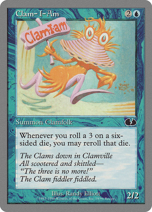
When we tilt our heads at a card like Clam-I-Am, the first thing that catches the eye is not just the blue mana cost or the cheeky flavor text, but how the artwork invites you to look deeper. This Unglued creature—blue, costed at 2U, a humble 3-drop by color and mana—drips with a playful sense of depth that rewards careful observation. In a set famous for its silver border and comedic timing, the artwork uses perspective as a storytelling tool as deftly as any hyper-real fantasy piece. 🧙♂️🔥🧭
The card’s color identity is blue, which in MTG often leans into water, thought, and subtle manipulation. That blue vibe translates into a visual logic of depth: overlapping elements, cool tones, and a calm, almost reflective light that suggests an undersea stage. The clamfolk itself sits at the center of the frame, but the eye doesn’t rest there alone. There are cues—a soft gradient behind the creature, a suggestion of ripples, a slight tilt to the horizon—that pull the viewer’s gaze into multiple planes. In other words, the artist builds depth not with a single focal point, but with a layered play between foreground, midground, and background. It’s a gentle reminder that humor and technique can share the same stage. Depth can be funny too. 🎨
Composition as a Gesture of Perspective
This piece leans into a classic compositional trick: scale and overlap. The Clam-I-Am appears sturdily in the foreground, its form a confident mini-sculpture, while the environment recedes with a soft haze. The result is not a flat illustration but a stage where the clam’s rounded shell reads as a portal into a micro-world. The curvature of the shell, the subtle shading along the hinge, and the tiny specular highlights work together to convey volume. The blue palette reinforces volume through tonal gradation—deeper blues recede, lighter blues advance—helping us perceive spatial relationships in a single glance. The die-flip mechanic printed on the card’s concept fits visually with this depth: within the frame, a chance moment sits at the intersection between certainty and whimsy, a perfect match for Unglued’s playful spirit. ⚔️
From a design perspective, the choice of a silver-bordered frame is more than a cosmetic decision. Unglued’s layout invites the eye to interpret panel-like segments, almost like a comic strip. That storytelling cadence is mirrored in how perspective lines guide you from the clam’s gaze to the hidden corners of its watery stage. The art’s rhythm—light, shadow, and the soft echo of blue—creates a believable space where a dice-related power could plausibly unfold in a humorous universe. The effect is subtle, but it makes the world feel layered and lived-in, even when the card’s punchline is as simple as a reroll. 🧩
Lore, Flavor, and the Depth of Humor
The flavor text anchors the moment in a whimsical Clamville, a place where even the trio of three becomes a punchline. The poem-like lines imply a culture with its own jokes, its own rules, and its own sense of timing. That timing translates visually as well: the art captures a single beat in a longer, unseen joke, a compressed moment that suggests a broader universe. The 2/2 body on a 3-mana investment is a nice parallel to the way the image stakes out space: everything is modest enough to feel approachable, yet thoughtfully composed enough to invite repeat viewing. The result is not just a card you play; it’s an image you study, a tiny diorama that rewards careful looking. Depth here is about patience and playfulness. 🧙♂️💎
The Clams down in Clamville All scootered and skittled— “The three is no more!” The Clam fiddler fiddled.
As a blue creature with a dice-related trigger—“If you roll a 3 on a six-sided die, you may reroll that die”—Clam-I-Am embodies a meta-narrative about perception and chance. The ability invites you to re-evaluate a moment, just as you re-examine a painting’s perspective once you notice a subtle cue. In Unglued, where humor and mechanics meet, depth isn’t just about geometry; it’s about inviting the viewer to participate in the joke. The card’s placement within the set’s permissive, non-competitive atmosphere enhances this sense of participation. You’re not just watching depth unfold; you’re invited to engage with it. 🎲
Artistic Style and Collector’s Context
Randy Elliott’s artwork for Clam-I-Am carries a crisp, accessible line that remains true to the playful energy of the Unglued era. The silver-border treatment signals a departure from the strict, story-forward design language of core sets and expansion-only blocks; this is an art piece that wears a wink as its crowning feature. The common rarity keeps the image approachable for collectors while preserving its charm as a talking point for newer players—how the art can convey depth despite budget constraints. The perspective work here is a masterclass in how to teach players to look beyond the obvious, to notice the layered background, the tonal shifts, and the narrative rhythm that makes even a simple creature feel like a stage for a broader joke. 🔎
In terms of gameplay synergy, the card’s blue identity and its dice-triggered reroll mechanic embody classic MTG humor: a moment of luck, a rule that can be bent by context, and a playful reminder that not all depth is serious—some of it is a giggle tucked into a 3-mana package. For collectors, that combination—nostalgia, artful depth, and a memorable quip—adds value beyond the card count. Unglued remains a beloved oddity, a reminder that MTG can be as much about shared stories and smiles as it is about winning a game. 🧙♂️🔥
- Key takeaway 1: Depth in MTG art often comes from layering—foreground forms that hint at a wider, unseen world.
- Key takeaway 2: Color and lighting choices in blue can suggest mood and distance even on a small card image.
- Key takeaway 3: Humor in Unglued enhances perceived depth by inviting viewer interpretation beyond literal action.
- Key takeaway 4: The rarity and border style set expectations for how an image should be appreciated in a collection.
- Key takeaway 5: Flavor text and card mechanics together reinforce narrative depth in a single frame.
More from our network
- https://blog.digital-vault.xyz/blog/post/turn-churn-and-payment-data-into-actionable-insights/
- https://blog.crypto-articles.xyz/blog/post/fallout-76-pros-and-cons-review-is-it-worth-playing/
- https://blog.zero-static.xyz/blog/post/the-psychology-behind-lugia-rare-pulls-in-pokemon-tcg/
- https://blog.crypto-articles.xyz/blog/post/magnemite-influencer-reviews-from-youtube-creators/
- https://blog.digital-vault.xyz/blog/post/wandering-stream-shows-why-silver-border-cards-spark-creativity/