Image courtesy of Scryfall.com
The evolution of MTG card frames: a look through Sootfeather Flock
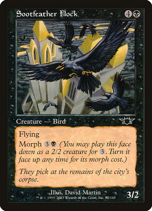
Magic: The Gathering has always been as much about its visual language as its strategic depth. The card frame—those borders, typography, mana costs, and flavor text—acts like a storyboard for the game. When you study a card like Sootfeather Flock, a Creature — Bird from Legions (2003) with a 1997-era frame, you can trace a tangible thread through MTG’s design history. This particular card—a common black creature with Flying and Morph—offers a perfect case study in how frame decisions of a bygone era still echo in modern playability and collector value. 🧙♂️🔥
A snapshot of a late-era frame: Sootfeather Flock’s identity
Sootfeather Flock carries mana cost {4}{B}, a respectable five-mana investment for a 3/2 flyer with a backstory that’s as dark as a black-mat night. Its type line—Creature — Bird—alongside its rarity (common) and its set, Legions (LGN), situates it in the 1990s-to-early-2000s frame evolution. This card is printed with the 1997 frame, a border style beloved by many long-time players for its compact typography and generous art space. The artistry is credited to David Martin, and the flavor text—“They pick at the remains of the city's corpse.”—helps frame the eerie, post-apocalyptic mood that Legions often evokes. The presence of Flying and Morph on the same card is a reminder of how the frame had to accommodate both the flourish of keyword text and the subtlety of flavor, without overwhelming the card’s silhouette. 🧭
In practical terms, Sootfeather Flock embodies the ergonomics of its era: legible mana costs at the top, a clean type line, a bold creature box, and an explicit reminder of its morphability. The Morph ability—“Morph {3}{B} (You may cast this card face down as a 2/2 creature for {3}. Turn it face up any time for its morph cost.)”—was a revolutionary design introduced around the same period, enabling players to bluff, surprise, or simply deploy surprise threats. The frame had to accommodate a face-down placeholder as well as the revealed text, all while preserving the iconic black border and the card’s black color identity. It’s a reminder that frame design is not just aesthetics; it’s a functional puzzle for memory, timing, and strategy. ⚔️
Frame design as a gameplay amplifier
The 1997 frame that houses Sootfeather Flock is visually distinct from contemporary frames in several key ways. The border is slightly thicker, the typography feels denser, and the mana cost sits in a compact box that leaves more emphasis on the text box than on glare-prone art alone. For a morph creature, readability matters: you want the reminder text to cue the morph cost clearly, without losing the narrative punch of “Flying” and the creature’s power and toughness. The balance achieved here—art, text, and mechanic at a comfortable scale—helps explain why players remember certain frames with such fondness. And as we’ve learned, a well-designed frame can become part of a card’s identity, contributing to collectible value and the nostalgia that fuels vintage and commander communities alike. 🧙♂️
“Frames are the fonts of a fantasy diary—the way you read the story changes as the borders shift.”
From border to readability: how frame lines evolved across eras
Over the years, MTG has experimented with frame geometry and typography to improve readability, accommodate new mechanics, and reflect broader printing technologies. The classic 1990s frames like the one used for Sootfeather Flock prioritized a dense, art-forward presentation. As sets expanded—introducing multi-colored mana, more complex keywords, and increasingly dense flavor text—the community watched the frames grow more optimized for on-table readability, even as some players clung to the “classic look” for its warmth and nostalgia. In practice, newer frames have increased art exposure, standardized set icons, and more legible mana costs, while older frames still shine in their compact elegance. The beauty of MTG design is that both eras coexist, offering a spectrum of aesthetics—from the moody shadow of Legions to the brighter, more expansive layouts of later sets. ⚡
For players who love the tactile side of the hobby, Sootfeather Flock also demonstrates how card borders can influence deck-building psychology. The creature’s 5-mana bill is a deliberate cost, and the morph mechanic invites you to consider timing and bluffing—skills that are heightened when the frame makes the text feel approachable rather than cramped. The old frame’s clarity helps players quickly parse what a card does mid-game, while modern frames push readability into a calmer, more streamlined zone—helpful for new players and veterans alike. This is why the frame is more than a cosmetic choice; it shapes how we play and how we remember. 🧠🎲
Collectibility, value, and the long arc of a frame
Legions’ Sootfeather Flock sits in a curious space: a common with a foil presence, a card that’s widely accessible yet carries the charm of a bygone border. Its listed prices—about USD 0.08 nonfoil and USD 0.33 foil, with a foil premium that hints at collector desire—underscore how frame nostalgia can elevate a card’s secondary-market interest, even when its stats aren’t dramatic by modern standards. The dual reality of a legal legacy card in formats like Legacy, Vintage, and Commander, paired with the Morphed potential to disrupt a game, helps explain why this card remains a favorite among players who chase “old frame, new tricks.” It’s the kind of artifact that invites a casual re-entry into a vintage vibe without breaking the bank. 💎
For fans who want to experience the blend of art and history firsthand, a comfortable workstation makes all the difference. A good desk setup—like an ergonomic memory foam wrist rest—lets you pore over card databases, compare frames, and test morph timing while you sip coffee and trade tales about legions of vintage cards. It’s not just about collecting; it’s about savoring the design language that MTG has refined for decades. 🧙♂️🎨
As you explore the frame’s evolution, remember that each frame shift carried a story with it: a new mechanic, a new era of printing, or a new standard of readability. Sootfeather Flock, with its 1997 frame and Morph-forward design, is a charming vignette in that ongoing saga—an artifact that reminds us how far card design has come, and how much fun it is to watch the craft evolve in real time. 🔥
Ergonomic Memory Foam Wrist Rest Mouse PadMore from our network
- https://crypto-acolytes.xyz/blog/post/speedrunning-pokemon-red-and-blue-ultimate-beginners-guide/
- https://blog.zero-static.xyz/blog/post/mtg-typography-and-layout-in-the-knight-of-commentary/
- https://blog.crypto-articles.xyz/blog/post/how-buizel-reprints-shape-pokemon-tcg-collector-demand/
- https://transparent-paper.shop/blog/post/sagittarius-hot-star-reveals-metallicity-clues-across-proxy-data/
- https://articles.zero-static.xyz/blog/post/the-most-likely-dlc-settings-for-rollercoaster-tycoon-classic/