Image courtesy of Scryfall.com
Behind the Art: Undersimplify and the Craft of Alchemy Horizons
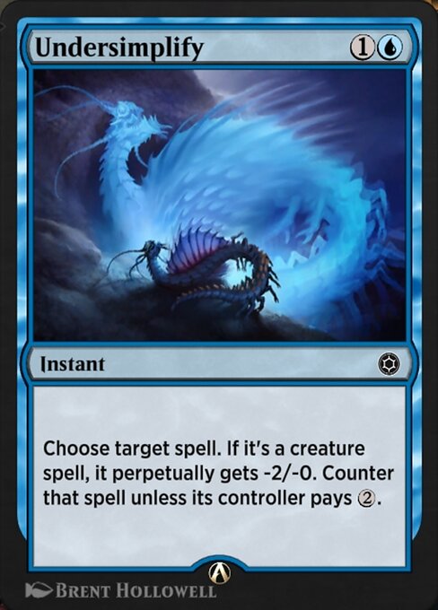
Blue mana spills across the scene, not with a chill of indifference but with a precise, almost surgical calm that you’d expect from a spell aimed at tempo and control. Undersimplify, an instant from Alchemy Horizons: Baldur's Gate, is a compact study in how design and production push a common spell into memorable space. It latches onto a creature spell, makes it perpetually weaker, and then taxes the opponent to counter it. On the surface, it’s a thoughtful little tempo play; beneath the surface, it’s a window into how blue’s intellect and play-patterns are translated into a single card—and how the art and production reinforce that idea with every pixel. 🧙♂️🔥
Choose target spell. If it's a creature spell, it perpetually gets -2/-0. Counter that spell unless its controller pays {2}.
Brent Hollowell’s illustration for this card (the Alchemy Horizons: Baldur's Gate print) captures a moment of icy calculation—the kind of stare you get from a blue mage who has calculated the exact mana tax and the exact moment to strike. The art reads clean and crisp, which mirrors the card’s mechanical cleanliness: you don’t need fancy tricks to see that the spell is being taxed and nudged off track. The artwork leans into a cool palette with hints of electric glow, a reminder that even a quiet blue moment can crackle with potential. And if you’ve ever played a blue deck that values tempo and disruption, Undersimplify lands with a wink—like a well-timed counterspell, but with its own twist. 🎨💎
Design notes: color, tempo, and the name
In the Alchemy Horizons subset, blue cards often push tempo and decision points, and Undersimplify exemplifies that ethos in a compact frame. The mana cost of {1}{U} positions it as an early-game option for a tempo-focused strategy, while the effect—perpetually reducing a creature’s power and offering a tax to counter—creates a layered decision for both players. The card’s rarity—common—speaks to its accessibility in digital drafting and Arena play, while its arena printing underscores a modern approach to card design that favors fast, readable, and repeatable interactions. The lore of Baldur’s Gate provides a narrative backdrop—blue wizards weighing the cost of counterspells within a bustling city of intrigue—yet the real star is the clarity of the play pattern: tax, tempo, and a touch of inevitability. ⚔️
The name itself—Undersimplify—feels like a wink to the player: in this world, the simplest answer isn’t always the simplest, and sometimes you need a little extra to keep a spell at bay. It’s a perfect microcosm of blue’s flavor: a mind that negotiates, calculates, and rearranges the battlefield with a few deliberate taps of mana. As you study the piece, you can almost hear the tiny pop of metaphysical gears turning behind the scene, a nod to the production pipeline that makes a digital-first card feel tactile and alive. 🧙♂️🎲
From sketch to screen: production techniques in the digital era
Undersimplify lives in a production context that blends traditional art sensibilities with modern digital pipelines. The Alchemy Horizons line leverages digital-first assets, often optimized for on-screen clarity and fast deck-building experiences. The artwork—delivered as a print in the digital realm—benefits from layered vector-like rendering, crisp linework, and a color pass designed to maintain legibility even in smaller on-screen formats. Hollowell’s piece demonstrates how subtle lighting and a restrained color palette can convey a sense of deliberate calculation without sacrificing vibrancy in a digital deck environment. The result is a card that looks deliberate when you zoom in during a match, and just as readable at a glance on a mobile device. 🔎🎨
In production terms, the card’s lowres image status and arena-specific footprint mean the art is optimized for speed and clarity, not for lavish print fidelity. Yet the charm remains intact: the glow accents, the cool tonality, and the typified blue serenity work together to help the card feel like a deliberate tool—one you can trust to perform its single, crisp function when you need it most. It’s a reminder that good card art isn’t just decoration; it’s a visual contract between the artist, the designer, and the player. 💎🔥
Why collectors and players both love it
As a common rarity in a digital set, Undersimplify doesn’t carry the flashy foil sheen of rarities. What it does carry is reliability: a dependable tempo play that can turn the tide when timed correctly. For collectors, the Alchemy Horizons: Baldur's Gate line represents a snapshot of MTG’s ongoing experimentation with digital-first design, and Undersimplify stands as a neat example of how a simple text box can inspire a thoughtful, almost cinematic illustration. It’s the kind of card that players casually admire in drafts and long-term collectors note for the crispness of its concept and execution. ⚔️
Cyberpunk Neon Card Holder Phone Case MagSafeMore from our network
- https://blog.digital-vault.xyz/blog/post/how-to-sell-digital-art-on-gumroad-a-step-by-step-guide/
- https://blog.digital-vault.xyz/blog/post/laughs-and-bonds-with-harmattan-efreet-at-the-table/
- https://transparent-paper.shop/blog/post/precise-parallax-redefines-luminosity-for-a-hot-blue-star/
- https://blog.digital-vault.xyz/blog/post/legends-behind-spinal-embrace-grim-necromancy-in-mtg-lore/
- https://blog.digital-vault.xyz/blog/post/dust-reddening-unveils-a-thirty-thousand-kelvin-star/