Image courtesy of Scryfall.com
Verdant Glow: Lighting and Mood in Hapatra's Mark Art
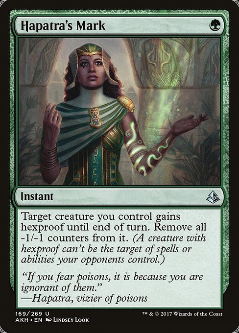
Magic: The Gathering’s card art has long been a portal into the world behind the text. In Hapatra's Mark, the ambiance of the illustration is more than window dressing—it’s a narrative device that communicates power, protection, and the quiet danger of poisons. The green instant from Amonkhet’s realm—drawn by Lindsey Look—asks us to notice how light, shadow, and color operate like a deft whisper between the card’s mechanics and its lore 🧙♂️🔥. The verdant glow that radiates from the scene isn’t just pretty; it’s a visual shorthand for hexproof’s shield and for the removal of troubling -1/-1 counters, a micro-play of resilience in a world where every creature can be a bargaining chip with fate.
The piece leans into the quintessential green identity, but with a twist that suits Hapatra’s Mark: a luminous, almost pollen-soft light that filters through foliage and flowers, casting dappled patterns on a target creature you control. The color palette nods to the toxin-tinged beauty of Hapatra’s poison artistry—emerald greens, mossy greens, and yellow-green accents that read as both life and warning. In this mix, light becomes a character: it both reveals and protects. The moment you glimpse the artwork, you’re invited to imagine the shield that appears the instant you cast the spell, a shimmering aura that hints at hexproof’s elusive nature and makes the shield feel tangible, tactile, and a touch magical 🎨⚔️.
Lighting in this art supports the card’s dual function: defense and restoration. When you cast Hapatra's Mark, you’re arching a protective arc around a key creature, ensuring it can survive the turn—perhaps long enough to swing back or to soak up a big threat. The hexproof aura is depicted as a soft corona, almost like a plant-born halo, which is both thematic and practical: the creature becomes harder to target, while the removed -1/-1 counters imply a renewal of vitality—another layer of the green light showing through the scene. The effect of “remove all -1/-1 counters from it” gets a subtle, hopeful glow; as counters disappear, the light brightens ever so slightly, reinforcing the idea that healing and protection are natural to the verdant cycle 🍃💎.
Design notes that bloom in color
Hapatra’s Mark is a one-mana green instant, a rarity that sits at uncommon yet sits comfortably in a multitude of green-based decks. The mana cost is as lean as a blade of grass, but its impact is deliberate: grant hexproof, then clear away the taint of -1/-1 counters. The lighting choices in the art echo this economy of effect. The scene is not a sun-drenched expose of power; rather, it’s a concentrated, intimate glow—like lantern light in a temple of green life. This mood aligns with the set’s broader motifs: the living, protective power of plant-borne magic and the idea that nature’s resilience often comes from quietly relentless, almost patient, radiance 🧙♂️🎲.
From a gameplay perspective, the lighting is a metaphor for timing and tension. Hexproof buys a crucial turn; removing -1/-1 counters can stabilize a board state that’s threatening to tilt. In the art, the moment of activation is visually captured as a brief flare, a green flash that gathers around the protected creature and dissipates any lingering danger. The result is a composition that feels cinematic—the kind of moment you’d expect to see in a fantasy film where a hero’s shield catches the final, creeping threat just before dawn. In short, the artist’s lighting communicates both the function and the timing of the spell in a single glance 🔥⚔️.
Hapatra, the vizier of poisons in the lore, sits in the background of the Akh-influenced world as a reminder that green magic can be as cunning as it is benevolent. The poem on the card’s flavor text—“If you fear poisons, it is because you are ignorant of them”—grounds the illustration in a philosophy as much as a spell. Lighting here isn’t merely aesthetic; it’s dialectical, inviting players to ponder how protection and restoration coexist with danger and poison. The glow suggests that knowledge of the poison is a shield in itself, turning fear into informed strategy—the sort of insight that makes green decks sing when they’ve found their balance 🧙♂️💎.
Practical takeaways for painters and players
- Mood via light: Use a green-dominated palette with subtle yellow-tint highlights to convey energy that is alive, slightly hazardous, yet protective.
- Focus on aura: Represent hexproof visually with a soft, enclosing glow around the protected creature, avoiding harsh lines to keep the feeling of natural muslin-light rather than a hard magical shield.
- Counter-play visuals: When counters are removed, let the light thaw a little from the subject, suggesting renewal rather than erasure—this echoes the card’s text in a visceral way.
- Lore-in-art: Pair flora-inspired motifs with the poison motif to create a cohesive worldbuilding beat that fans can recognize across green cards in Akhm/akh-inspired sets.
- Collector angle: The art’s texture and the rarity of the card (uncommon) pair with Lindsey Look’s signature style to elevate the piece in a collection focused on plant-kin aesthetics and the tension between growth and danger 🎨🧙♂️.
While we’re admiring the verdant glow on the card, you can carry your own glow in real life with a practical companion: a durable, slim, clear silicone phone case that keeps your device safe without hiding your style. The product behind this article is a perfect everyday sidekick for fans who live in the same world as Hapatra’s Mark—green-minded and gadget-ready. The blend of practical, visual, and magical aesthetics makes both the card and the case a small but satisfying corner of the multiverse to inhabit 🧩🔥.
Clear Silicone Phone Case - Durable Flexible SlimMore from our network
- https://crypto-acolytes.xyz/blog/post/minecraft-fireworks-for-elytra-boosts-and-techniques/
- https://blog.digital-vault.xyz/blog/post/astrometry-reveals-indirect-metallicity-of-a-blue-hot-milky-way-giant/
- https://blog.digital-vault.xyz/blog/post/renegade-firebrand-and-the-cognitive-load-of-complex-effects/
- https://crypto-acolytes.xyz/blog/post/reddened-hot-giant-at-21-kpc-illuminates-galactic-distances/
- https://blog.digital-vault.xyz/blog/post/cankerous-thirst-origins-lore-and-set-context-for-mtg/